

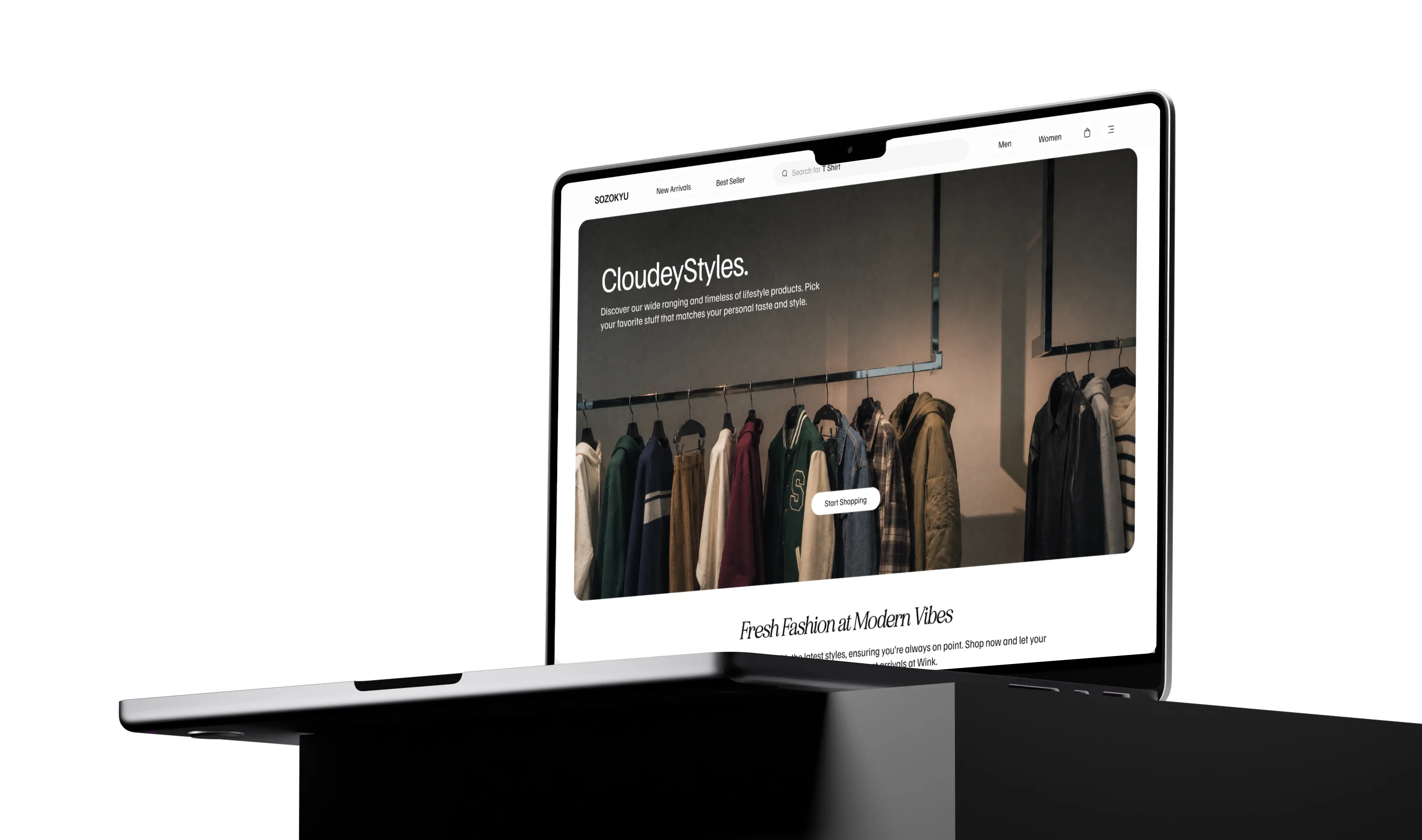
The starting point
A brand needs more than a pretty URL.
A great brand deserves a website that lives up to it.
Fitside needed a digital storefront that could bring its identity online while making the shopping experience straightforward. We approached the project with one goal: create a website where the design catches your eye and the experience keeps things moving.
The product approach
Good design. Zero unnecessary drama.
Before getting into the code, we focused on how the website should look, feel, and function.
The priority was to establish a clear visual hierarchy, organise the content, and create an interface that guides visitors naturally from the first impression to product discovery.
No clutter for the sake of looking fancy. Every section needs a reason to exist.
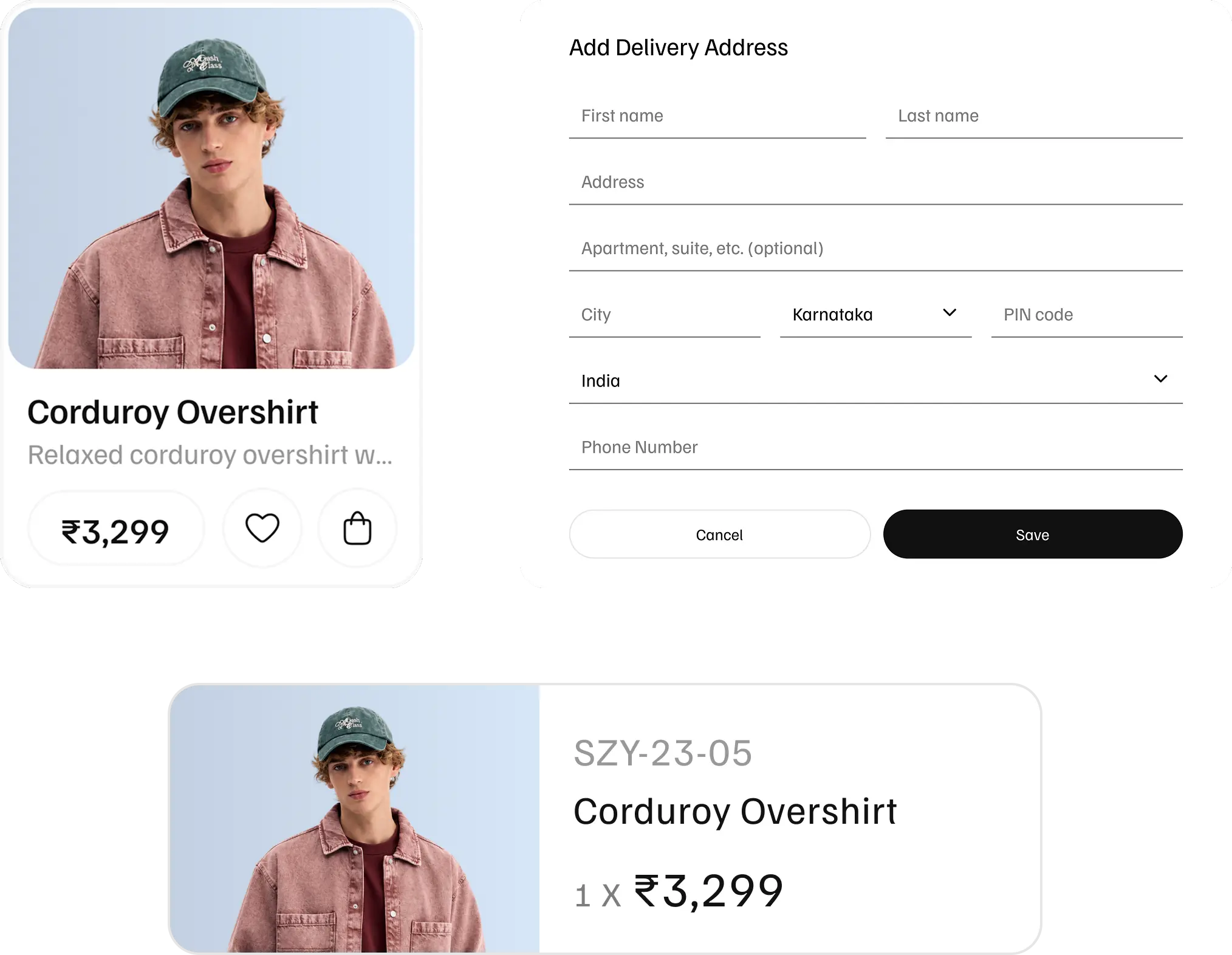
Art direction
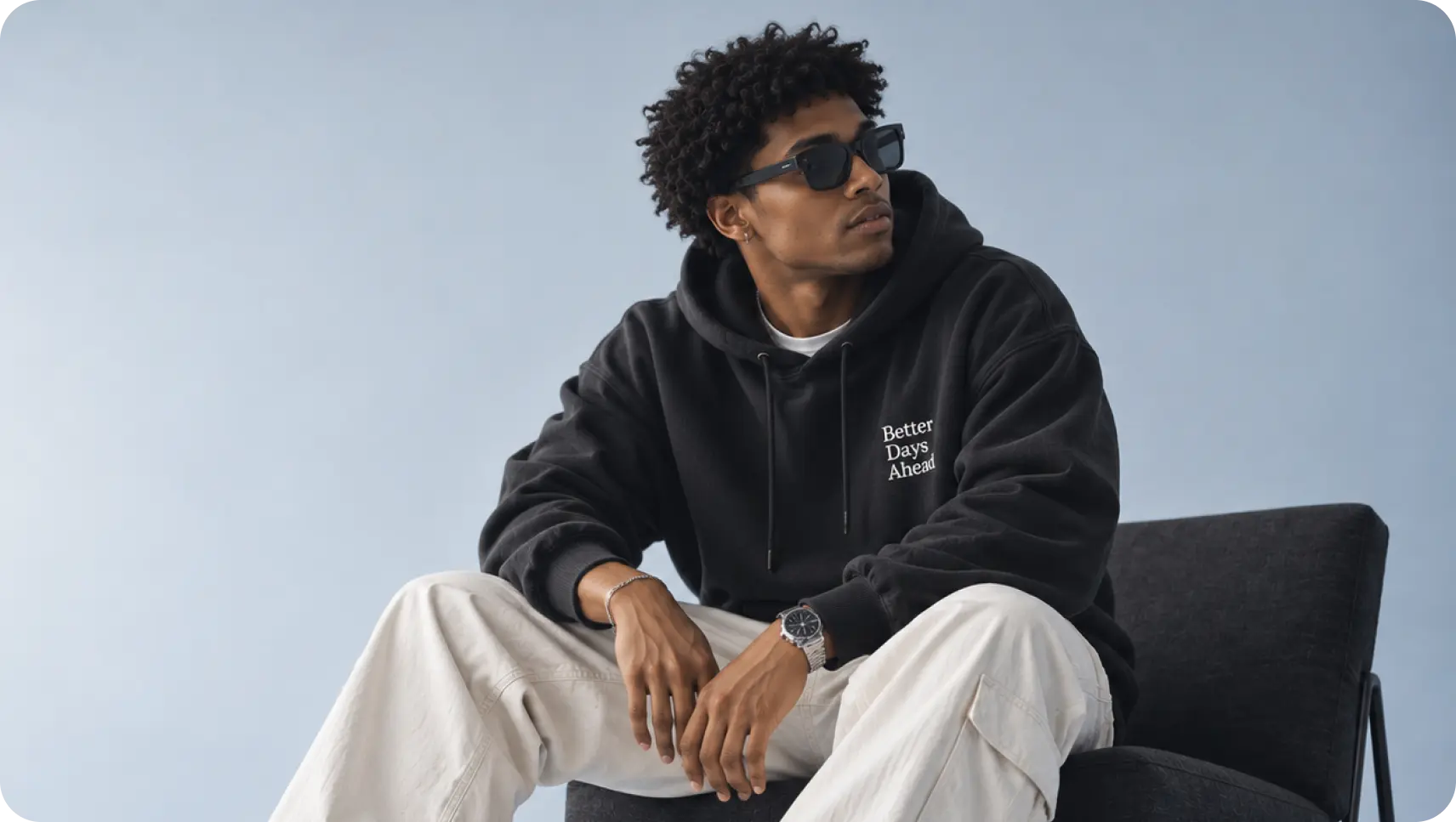
Let the fits do the talking.
Every visual choice has a job. The typography sets the tone, the layout creates breathing room, and the product imagery gets its moment in the spotlight.
The goal? A storefront that feels like a fashion brand, not another cookie-cutter online shop.



Design & development
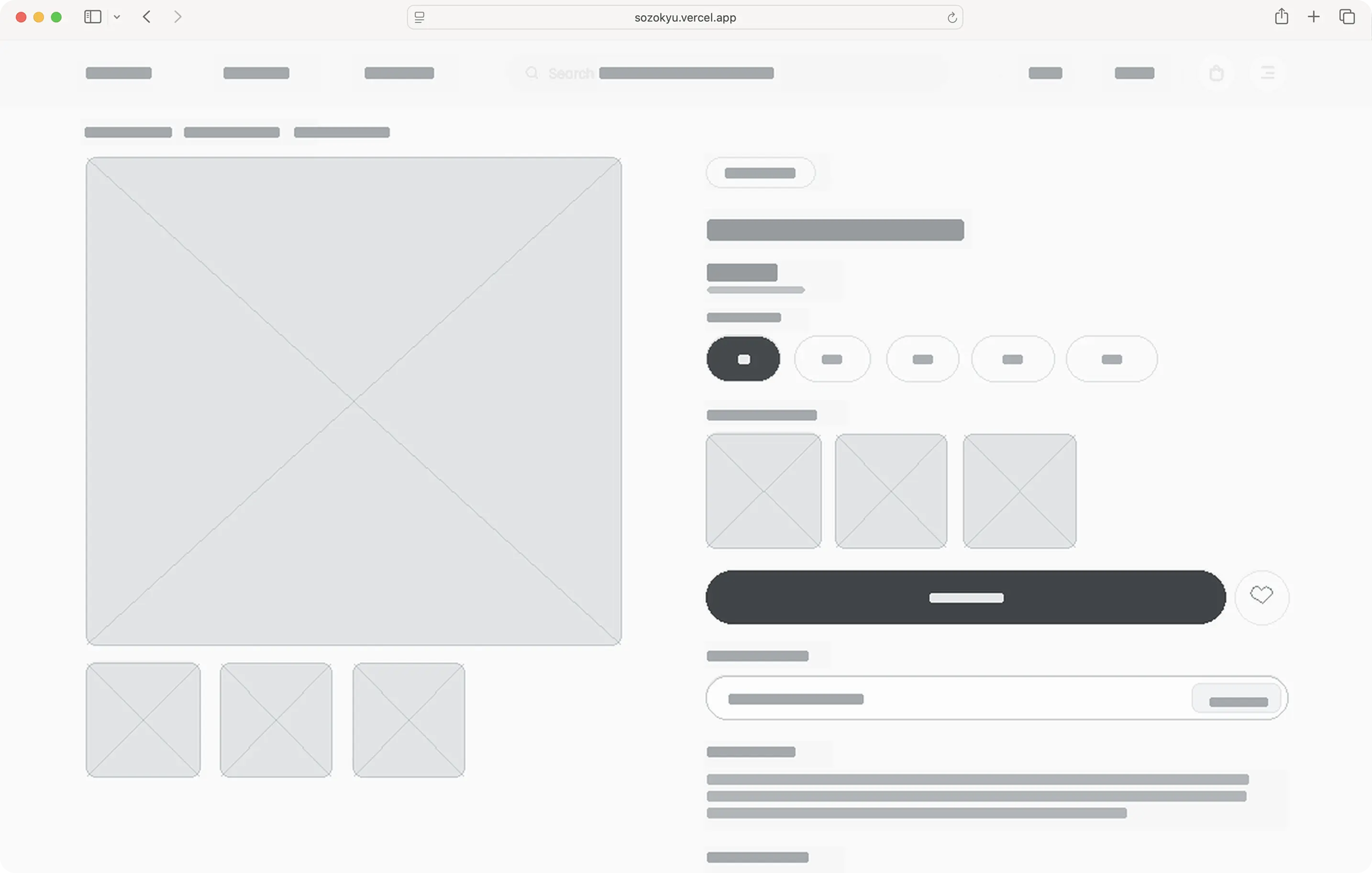
From Figma vibes to browser reality.
A design looks great in a mockup. Making it work on a real screen? That's where things get interesting.
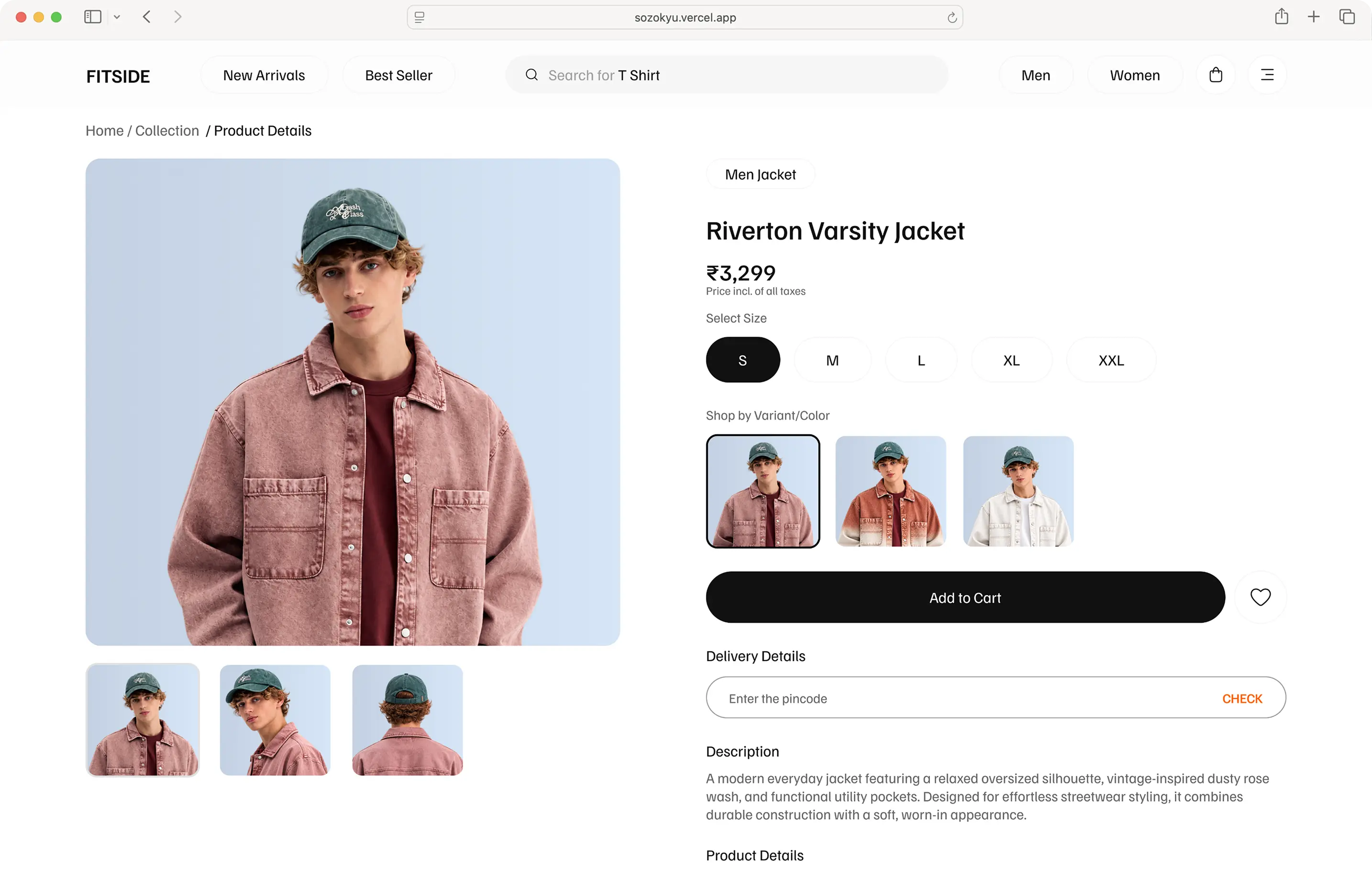
We translated the visual direction into a working web interface, bringing layouts, typography, spacing, and interactive elements together in the browser.
The focus was on keeping the implemented experience consistent with the design while making the interface practical to use and easier to maintain.
The Build
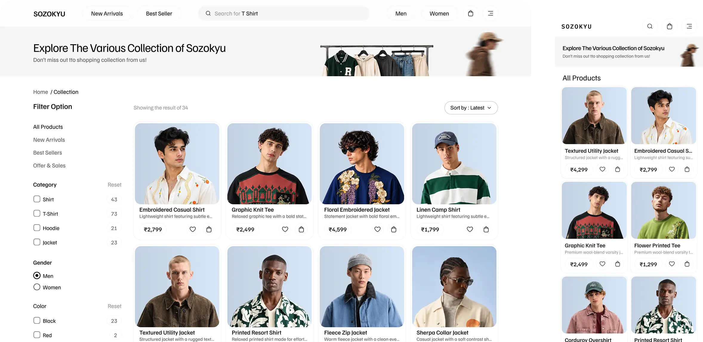
One website. Multiple screen sizes.
Your customers aren't all shopping from the same device, so the experience shouldn't depend on one.
We considered responsive layouts and adaptable content presentation to help the website work across different screen sizes.
From layout proportions to readable content and accessible controls, the details matter. Because a website that looks good only on your laptop is only doing half the job.
Under the hood
Pretty on the outside. Thought through on the inside.
A polished website needs more than good visuals. Its interface should also have a sensible structure.
The development approach focuses on consistent layout patterns, reusable interface elements, and predictable behaviour. These foundations help keep the website organised as the experience evolves.
The aim is simple: make the code support the design, not fight it.
The final build
From design files to the real deal.
The result is a live storefront that gives Fitside a dedicated digital presence and brings its brand experience into the browser.
It's where visual design meets practical implementation—and where the idea finally becomes something people can explore.
Less mockup. More make it real.
What's next?
The web is never really done, and that's a good thing.
Performance checks, usability testing, responsive refinements, and feedback from real shoppers can help identify what to improve next.
The goal is to keep making the experience smoother as the brand grows.